 Haochu Machinery
1 / 3
Optimizing your website for modern search engines requires a balanced approach. By structuring content logically, ensuring mobile responsiveness, and providing rich multimedia elements, you can significantly enhance both user experience and search engine visibility.
Always ensure that your visual assets are compressed for fast loading speeds while maintaining their original proportions to avoid display distortions.
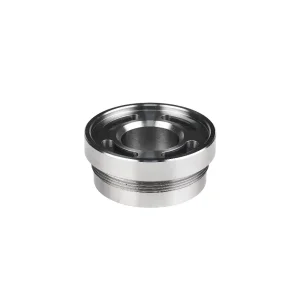
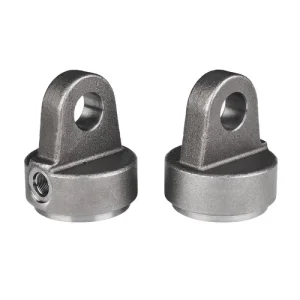
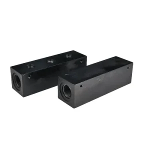
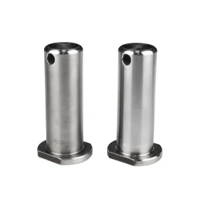
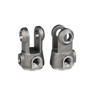
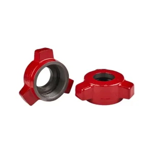
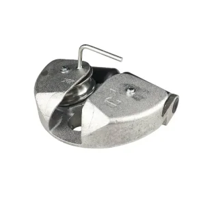
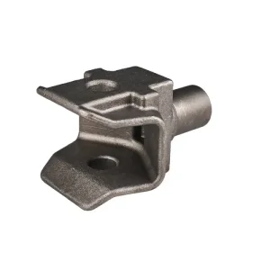
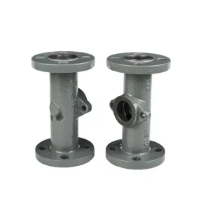
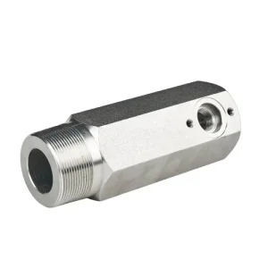
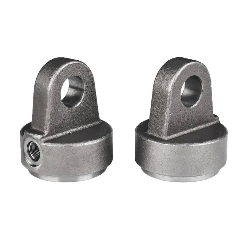
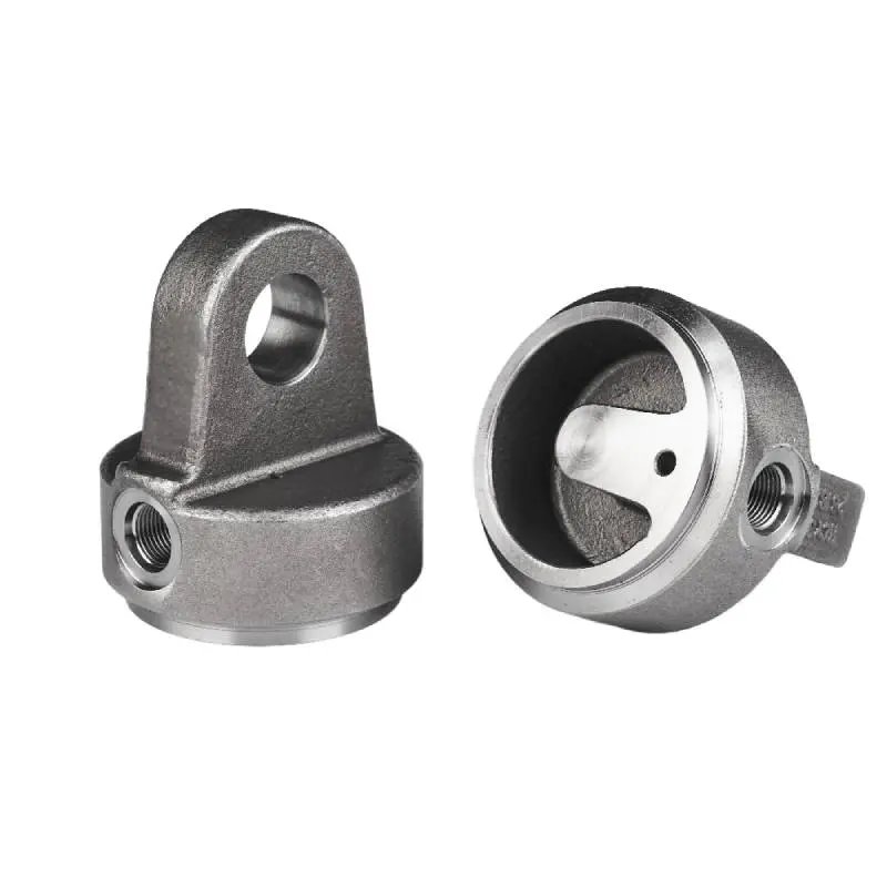
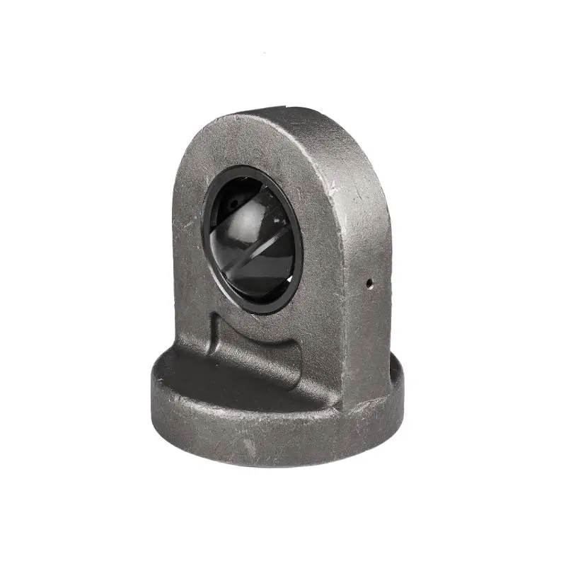
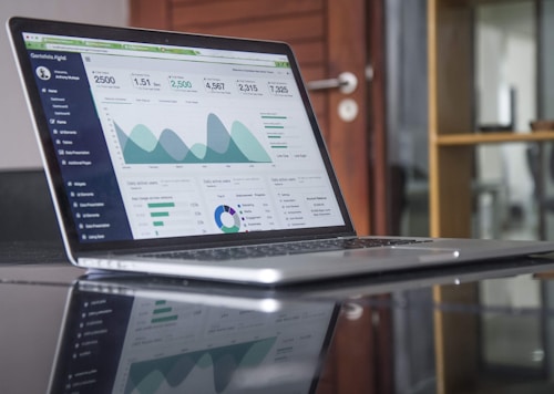
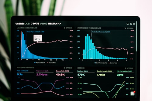
High-quality images play a crucial role in engagement. Below is an example of a multi-image layout that adjusts seamlessly across devices, ensuring that your products or services are presented with clarity and style.

Integrating video content boosts dwell time, which is a positive signal for Google SEO. The video player below is fully responsive and fits naturally within the content flow.
Google uses mobile-first indexing, meaning the mobile version of your website is the baseline for how Google determines rankings. A fully responsive design is essential for maintaining search visibility.
Preserving the aspect ratio prevents visual layout shifts (CLS), which is a key metric in Google's Core Web Vitals. It also ensures a professional and clean presentation for users.
To maintain high performance and clean aesthetics, individual images in this layout are constrained to a maximum width of 600px and are arranged in responsive rows of 2-3 items.
Yes. The CSS classes are uniquely prefixed with "aicc_" to prevent style conflicts, making this code safe to insert directly into WordPress, Shopify, or custom HTML blocks.
Videos enrich user engagement, decrease bounce rates, and increase average session duration. These positive interaction metrics signal search engines that your content is valuable.
Absolutely. The grid system uses flexible box properties that automatically stack elements vertically on smaller screens, ensuring a perfect browsing experience on any smartphone or tablet.